Buildesk - Portfolio site's design process
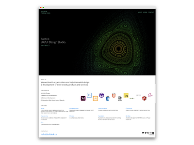
This is the complete landing page of the Buildesk design studio, that I've been working on.
I have tried to keep it as a single page website because they are much easier to understand. A visitor could easily navigate the page through the navigation links and the page would automatically scroll to the required section.
The page is divided into four main sections - Intro, About, Work and Contact; all stacked one after the other. making it easier for visitors to grasp all the information without leaving the landing page.
When the visitor lands on the page, they see this giant moving fractal - called Henon phase fractal. It signifies nothing, but it looks beautiful, so it's there.
The layout is quite simple, and in future, it would be easier to add more sections, for example, a section for recent blog posts could be easily integrated right after the work section.
Tell me what you think. https://buildesk.co