Unofficial Redesign UseeTV Remote App (iOS) Part 1
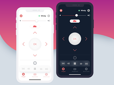
While the original app is only available for android, but I wanted to challenge myself to create app with newest iOS guideline instead of material design. No user research here, just to practice UI. I'll post the micro interaction animation on another shot on dribbble.
However started from I'm often frustated when using the original remote app, such as wrong tap between OK button and move player (arrows) especially when I'm carrying my younger son hehe... Not to mention on the UI that not really follow the ideal standard such as white space and margin among elements. Even though maybe they've already reached the business goals by the users purchased this product but at least in the UI side, we need to give more concern on the details too. So it looks more professionals as this is a big brand.
Also I simplified some feature placements such as to use players navigation (play/pause, rewind, ffwd), I made it only appears when user hold -not tap- the play/pause button to simplified the layout (detail of animation on next post) and also removed 'Choose Device/STB' button on the top (that button is to choose device). So that users only can choose it on the settings. In the original app users can open it both in a button on the top of screen and on the settings. I think and assume that it's not really necessary to put that right on the front screen since only users with their own device using this app and the app will detect it or only one device that regularly use for remote.
I haven't tested it to any users, although I'm the user myself. The main goals of this redesign is to re-imagine the interface layout.
This is the current original interface on my device https://i0.wp.com/www.candra.web.id/wp-content/uploads/2018/07/remote-1.jpg