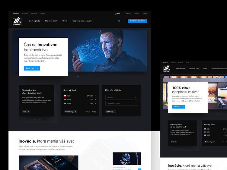
Tatra banka website redesign - homepage
Tatra banka is the most innovative and for 14th year in a row holds a title of “Best Slovak Bank”. For the last decade, it has been a leader in innovations by bringing internet banking to the mobile phone, smartwatch, voice and face biometrics, etc. Since 1990 it has won over 130 awards granted by 30 awarding authorities.
PLATFORM was in charge of the redesign of all Tatra banka’s websites including Internet banking. Along the redesign, we were able to push through some UX changes, that also affected some functionalities.
This ongoing cooperation lasts more than 2 years, during which we have produced hundreds of screens and the largest design manual. Blood, sweat, and tears were put in every single element that was created.
More by PLATFORM View profile
Like
