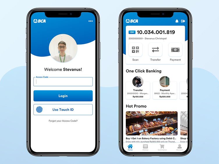
BCA Mobile Redesign Concept
BCA is one of the largest banks in Indonesia.
In this concept, i give fluid shape to show flexibility characters to adapt with millennial market. I also give gradient on its company color to bring fresh & modern design without changing the existing blue-ish top in mind branding.
I simplify the Login, so users can focus to fill Access Code. Other links can be seen in the top right 3-dots.
On Home page, i show the balance and 3 main transaction shortcuts for easier interaction. One Click Banking is my suggested feature to make recurring transaction easier. Hot Promo is also displayed here because it's a hype in Indonesia market, especially on modern Financial Services.
This is my personal concept exploration and not affiliated with BCA Bank - Indonesia.
Contact me: stevanus.christopel@gmail.comhttps://www.linkedin.com/in/stevanus-christopel/
