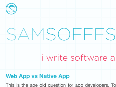
New Homepage Concept
Here's the full shot: http://soff.me/2dB0
I was thinking about taking grid system more literally and doing it both vertically and horizontally. I've been going back and forth on making the grid super visible and really light. I also want to feature my new mark more that the fabulous Kyle Steed designed for me.
More by Sam Soffes View profile
Like
