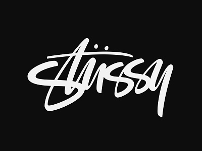
Stussy
Another logo redesign/rework exercise, this time for Stussy. A brand that I really enjoy and always found their logo to be quite interesting but I wanted to try and give it a cleaner look plus refine the letterforms. At the same time not distancing it self too much from the original in terms of its general layout which gives it character. What are your thoughts?
More by Miguel Spinola View profile
Like
