Album Art
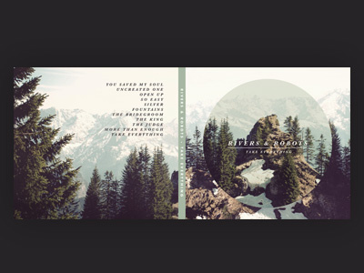
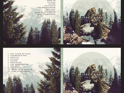
So, the new Rivers & Robots album I've been writing and recording is finally all written! Still a bit of mixing and mastering to do but it looks all set to be released on the 20th July, and I'm super excited. So I'm just working on the album art. And yes, you're getting a sneak peek at the track list here (which isn't the final order, but might be).
I've attached a larger image for your feedback. I'm wondering if I should flip the image on the left or not. I can have it the way you see in this shot, which I think flows better with the front cover design, or I could clip it, which means the text is left-aligned and can have numbers on (numbers look weird on the right-aligned one). So I'd love to hear your thoughts on the attached, top or bottom? And of course any other general feedback you have would be super useful! Thanks.

