Redesigning GIMP's toolbar icons: A GUI study

Personal exercise. Redesigning GIMP's graphical user interface toolbar icons.
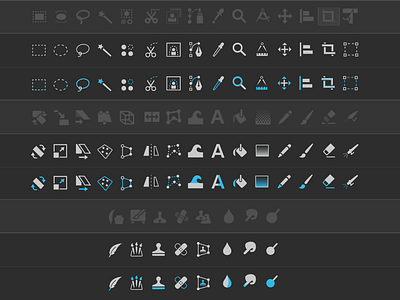
Original icons are displayed for reference. They have been darkened to avoid eye fatigue ;)
Redesign work explanation: - 2 versions: "Monochrome" and "Color highlight" - Some shapes have been redesigned to be more descriptive with their real meaning/usage - Some shapes have been replaced by some generic and more widely understood ones - Some shapes have been simplified and/or optimized in size and position to make them more recognizable