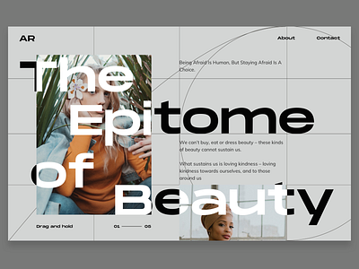
Typography Exercise 01
Hey guys, I know that having big fonts over an image is a no-no, But in here, I just played with the composition and font. What do you guys think? I think the golden ratio went off here. Shrugs*
More by Christian View profile
Like


