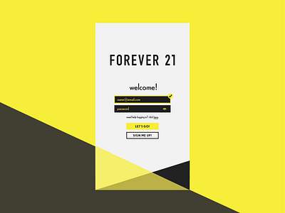
Forever 21 Login
Hopping on the Daily UI challenge! Day one is a signup/login screen. I chose Forever 21 because I wanted to work with their limited color palette. I am new to the UX/UI design scene, and it was interesting figuring out how to make the colors work in a way that would be easiest for the user to read and good for accessibility. Let me know how I did?
More by Nia Bailey View profile
Like
