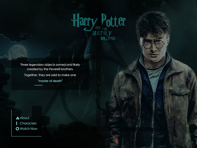
Landing page for Harry Potter Film
DailyUI–003 Landing Page.
This is the third design for my DailyUI challenge.
A Landing page design for Harry Potter and the Deathly Hollows movie.
I am a big fan of Harry Potter movies and I was confused about which movie to choose. Then I thought about the elements in each movie and the I remembered that there are specific shapes (or icons) in the movie "Harry Potter and the Deathly Hollows". I thought the I could tinker with those icons in the UI.
After that I downloaded (selected, cropped and merged) images for the background.
For the title, I decided to make it look like 3D. But because of the background, It wasn't looking as I expected. So, I decided to make it flat and having the theme colour.
And finally after deciding all the elements for the UI, it was really hard to place them together and make them look like a landing page. After lots of experiments and references I was satisfied with it. 😊
Software(s) I used to make the design: Affinity Designer Affinity Photo @Affinity
Resource(s): I don't really remember the website for the images and I feel really bad about it 😔. But it was stock free images for sure.
