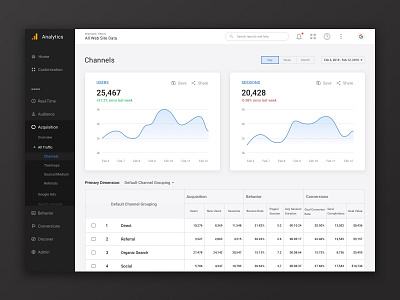
Google Analytics Web Redesign Concept
A Study In UI #006 Google Analytics Web Redesign Concept
Align with Readability in Mind
"When the decimal in a list of numbers is always in the same place, they’re a lot easier to compare at a glance."
A Google Analytics Web Redesign Concept used to demonstrate the difference in aligning text or number for better readability. Particularly in table, forms, dashboard or any kinds of data representation user interfaces, it provides more pleasure and better readability for users to have decimals/floating numbers aligned to the right.
-
Thanks @Steve Schoger and Adam Wathan again for pointing out this important knowledge in their book Refactoring UI
More by Zixuan Kevin Fan View profile
Like

