Typeface revisions
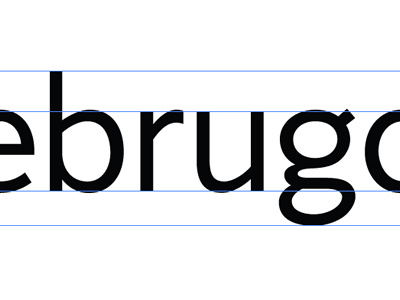
Latest revisions. Working a new /r/ to match the other letters better, made some optical adjustments on the junctions between bowls + stems and fixing the contrast on the double storey /g/
More by Claire Coullon View profile
Like
