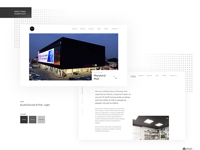
Client Website
This design didn't make it to the client's cut.
I love this design's simplicity and use of white space, and the monochrome brand colors made the project fun to work on.
You know that feeling when you 😍 a rejected project and you just can't let go.
More by Chen Emechete View profile
Like
