Financial website - WIP
Hi guys!
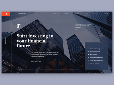
This is a hero exploration shot for a financial website. My goal was to find the best way to connect with the audience. In this regard I used bold typography together with a powerful image to focus the user attention.
Next the user will see the main services that company offers. In terms of user experience I wanted to meet the user's needs in this specific context - to find a financial service that fits his requirements.
I adopted a balanced composition with a easy to use navigation and clean user interface.
Have a wonderful day friends!
Daniel
More by Daniel Timofte View profile
Like


