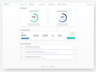
"financial assistant" dashboard
I'm currently experimenting with applying a new style guide to the user dashboard section of our financial mgmt app. It's a basic overview screen leading to more detailed sections.
The changes included updating colours, card style, iconography, font, etc: basically, your general look & feel.
I ended up streamlining it a bit in the process, moving the navigations, removing endless list of notifications and focusing on one offer card.
The most important part are obviously the scores, so they remained the most prominent feature.
More by Gonia Cholewa View profile
Like

