Logo Reimagined: Ace Realty
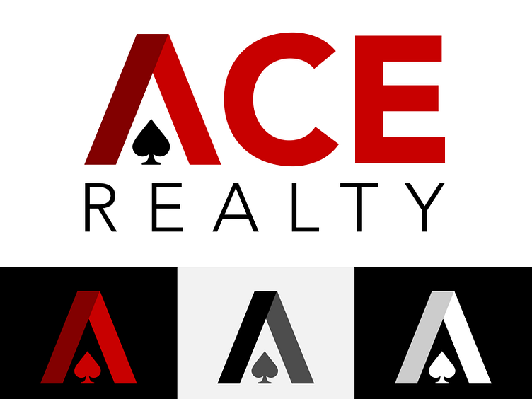
Reimagined logo for a residential realty company.
The stylized A represents a roof over the spade—I wanted to play into the word “ace” while giving a subtle nod towards the residential aspect of real estate.
More by Darlene Kamperveen View profile
Like
