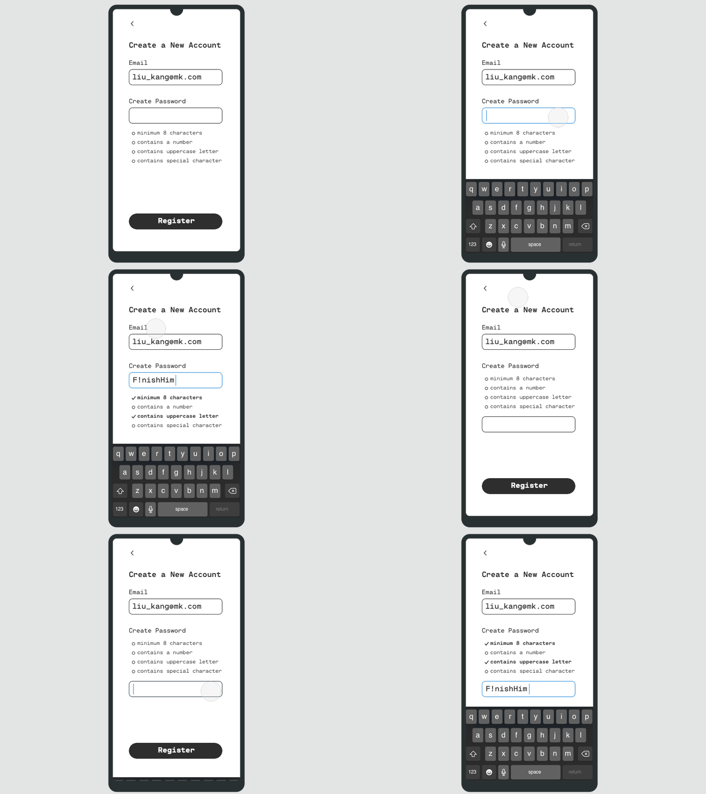
Password Criteria Position - Above or Below?
Which is a better location to display Password Criteria?
My take: it's better if the password criteria is positioned above the password input field.
Reasoning behind this is simple - English reads from left to right and top to bottom, and it's helpful to have read the criteria before reaching the actual input field.
More by Farrúh Tillaev View profile
Like


