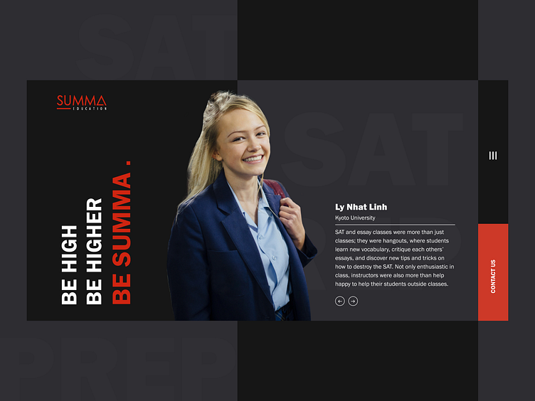
4. Summa Education
Hi friends, We're so glad to be a website partner of Summa.
This website, We use two main colors - Red and Black and bold fonts to show off their professionalism. Images on website follow a guideline in order to create their specifics.
Press "L" to appreciate it. You can follow us on Facebook | Behance
More by M1. Studio View profile
Like
