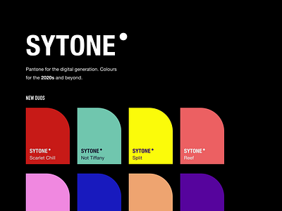
Sytone - Forthcoming Side Project
Yo Dribbble Fam!
It feels like Pantone has become more focused on the print and fashion industries in recent years. Whilst only releasing one colour a year might work over there, in the fast-moving digital age, it's all about screens, what looks good on them, the contrast, it can be hard for someone new to design to get their head around.
More and more people are starting businesses and they need colours more than once a year, and examples of how to use them. So I present, Sytone - Colours for the digital generation, and the founders and innovators of the future.
I created Sytone to help fellow designers and future visionaries to have a repository of reliable colours, and examples of how to use them.
The core three elements in Sytone will be:
Duos: Pairings of WCAG approved (above recommended contrast ratio), colours that look totally awesome and you can use for your next project. There'll also be a few examples of how the colours can be used, maybe some font pairings. We'll see as it comes together.
Trios: as above, but with one more colour 🎨
Gradients: 2, 3 and sometimes even 4 colour gradients, for your ocular amazement.
I hope you’re as excited as I am.
It will be launching in the next couple of weeks. If you want to hear more about that, other forthcoming side projects, my design thoughts, work, and more shiny things - Give me a follow on Twitter and I’ll keep you up to date.
Speak tomorrow,
Jamie
🌪
PS: Going to write these slightly longer descriptions to help frame things a little better and keep you in the loop with what's happening. More news on Pyrismic soon too for those of you keeping up.
PPS: I'm looking for awesome startups who want to level up their web app, landing page, or mobile app design. If you know of anyone looking for some high quality, remote assistance. Hit me up 💜


