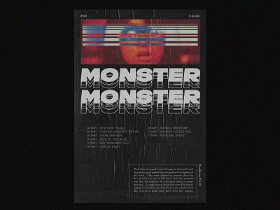
Monster - Nº 001
This is my first poster design, I had a great time designing it.
I believe I'll be designing more stuff like this, it is a great exercise to practice some fundamentals like color, layout, typography, composition, use of white space, etc.
Also, it would be awesome to hear some feedback from you guys, what is good, whats is not and how can I improove?
More by Arthur Pires® View profile
Like
