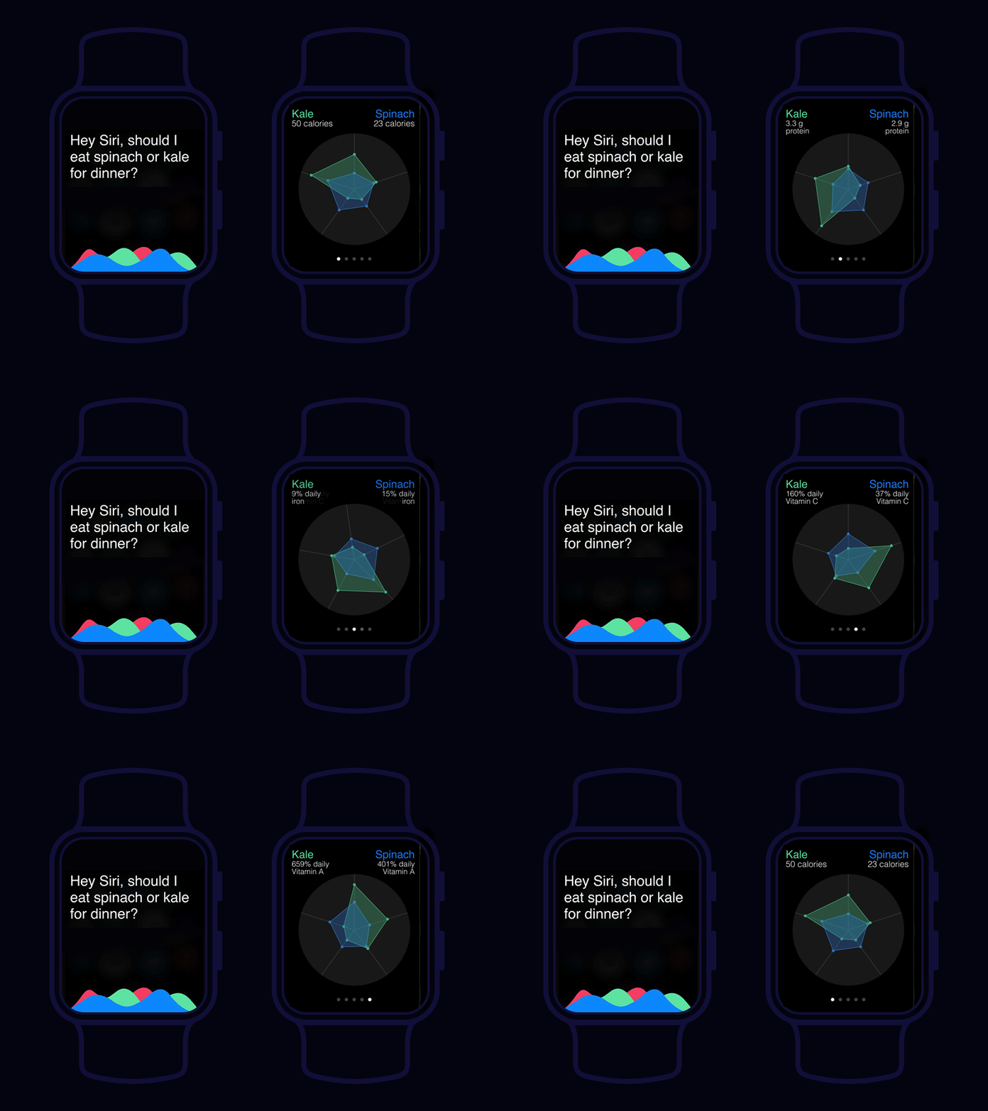
Apple Watch Analytics Chart
For #DailyUI 018 I wanted to explore making a simple data function for an Apple Watch to push myself to design simply for the small screen. I took heed of the Apple Developer Human Interface Guidelines advice to use black for the watch app background color so it blends seamlessly with the Apple Watch bezel and creates the illusion of an edgeless screen. I then chose to experiment with a different type of circular graph than I have seen on current Apple apps: a radar. I chose to break down the nutrition info of two types of foods across 5 measurable, unrelated comparable data points, which could be selected by the user based on dietary preferences or generated by Siri. To avoid data overload, I only show one set of stats at a time but the whole graphic can be understood at a glance.
TOOLS Invision Studio, Photoshop
