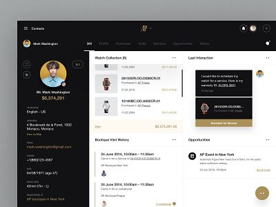
Audemars Piguet - Store Front Animation
Hi everyone,
This is part of the ipad app we worked on for Audemars Piguet. This depicts the storefront ui.
Service is everything at Audemars Piguet, with all customers greeted personally and served depending on their need.
Furthermore, we learned that many people visit the store for reasons other than buying – often coming in to service an existing watch, or simply to find out more information.
We knew the digital solution needed to make that personalised level of service even better and more seamless for everyone involved.
Problem
As a traditional brand famed for its high-touch customer service, they needed help to embrace new technology and better connect the refined atmosphere of their boutiques to their digital interface.
Solution
Our goal was to align the user experience with the brand concept, which we achieved by refining and improving user flows on their in-store iPad app, and by giving it a new look and feel that was both modern and responsive. We worked with them to bring the latest technology to the in-store experience, and support their staff to offer the best possible care and attention to customers.
Thanks to our animation guys @lucas marinm and @Stéphane Gibert
