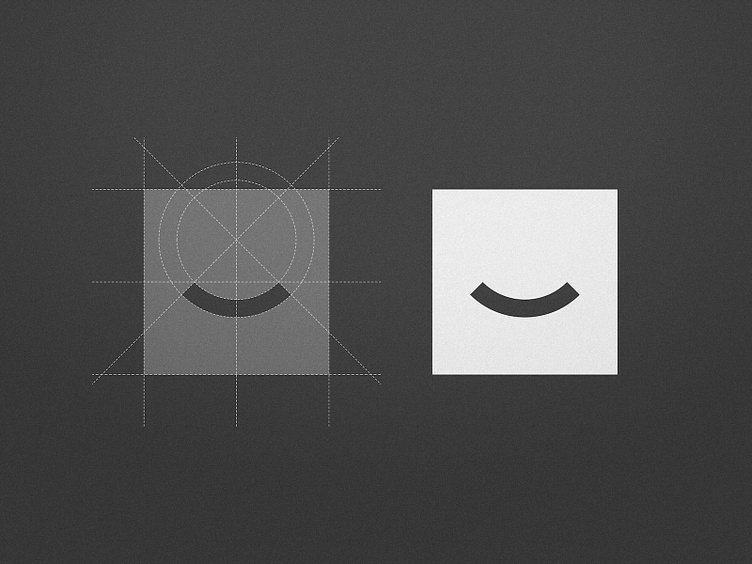
The Smile Space - Logo Breakdown
Minimalism was key for this branding project, and, in my opinion, the more minimal a logo is, the more thought that has to go into it, to make sure the few elements of it are well proportioned and correctly aligned 👌
I’m curious, what's your favourite style? Minimalist Logos, Sports Logos, Vintage Logos...?
More by Wisecraft View profile
Like

