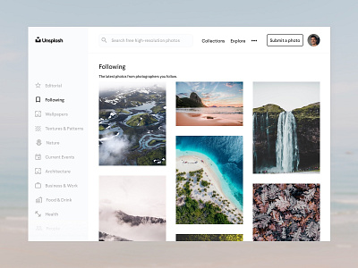
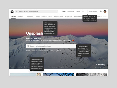
Unsplash Redesign Concept
A Study In UI #001 80/20 Unsplash Redesign Concept
80/20 Rule
"A high percentage of effects in any large system are caused by a low percentage of variables."
An @Unsplash UI Concept that tries to reduces the complexity of navigation bars. By separating the secondary navbar, it makes frequently used functions easier to access and creates a clearer visual hierarchy. Identifying the critical 20 percent of the functions - Home/Logo Button, Search, Collections, Explore, Submit Photo and Profile Settings - and making them readily available in toolbars above solves the problem. In addition, the new UI displays a more modular approach of showing featured images.
More by Zixuan Kevin Fan View profile
Like

