Energy Unlimited

Local Logo Redesign: Energy Unlimited
https://www.instagram.com/steveraboin/?hl=en
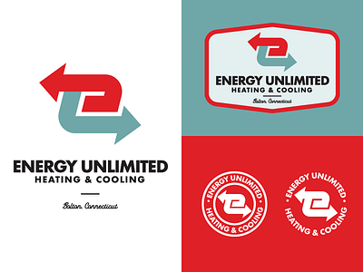
I see this massive sign on my commute to work and think it could use a makeover. The logo that they’re using looks a bit like clip art to me. I notice a lot of these HVAC guys use a similar look or a mashup of icons that try to describe what they do. I simplified the idea of heat/cold airflow with an E mark. What do you think?