Rune Inspired Logomark

This is my personal logomark. I'm excited about starting to actually use it in more places 😁
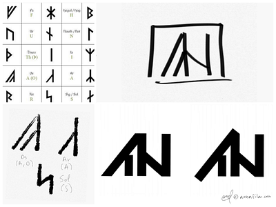
I've always loved the look of Norse runes and so when I sat down and started brainstorming ideas for a personal logo, one of my first thoughts was runes. My name is Anna and the logo is supposed to resemble the 2 letters my name is made up of. I did a Google image search and came across the runes on the top left, which apparently aren't even Norse, but rather created by some Austrian guy that was a lot into that kind of stuff. Anyhow, I liked the look and sketched the ones that looked like A and N, then combined them into a rough logo 🙃
Regarding the two versions on the bottom right.... I personally prefer the one on the right but all the people I've asked say it looks unbalanced so I went with the one on the left.
I'm interested in reading your thoughts about it; which one feels better?