Thistle Icons
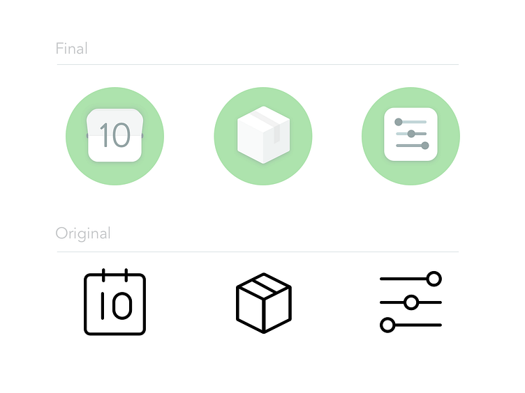
An iteration concept of the flat icons currently used on www.thistle.co . The goal was to make the icons more vibrant and add more details to make them stand out more from the text elements on the site. While these elements are important they often get overpowered by the colorful ingredients in our photography. By adding some depth and proportion these icons were meant to highlight key features that make managing the service easier. Just like our platforms features don't compete with the meals, they're not meant to compete with the meal photos but to work in conjunction with them.
More by James McNab View profile
Like
