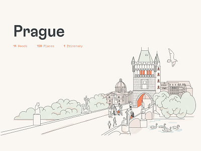
Dorsia Illustrations — Europe
Dorsia is a new travel app for the ’un-tourist. It's a lifestyle brand for people who love traveling and hate lifestyle brands. Using fancy algorithms that identify local trendsetters and global hobos, the product tracks down the places where everybody wants to be, before everybody wants to be there. It’s an always on, always up-to-date source of safe spaces for users to descend upon before the world falls to pieces.
Ueno created this new brand from scratch. We started with the strategy, quickly identifying some core beliefs to unlock their brand promise. We discovered that every city has a secret, its own rhythm, its own secret handshake. Finding it is what makes a city worth living in or visiting. We came to believe that tourism is a trap, and that life is not a to-do list.
As the attitude of the brand began to take shape, it heavily informed how we approached the look and feel of the identity. Every element needed to feel considered. From the pinkies up logo to the slightly naive wordmark. From the beginning, Ueno and Dorsia agreed we would create a strong brand who will not do as it's told — it’s a bit bourgeois punk, a real square peg.
We’re delighted to see the brand and product come to life and cannot wait to tell no one about it. So here’s to the non-conformists, the democratic hedonists, to local globalism and the untourist. You can find us at that brunch spot nobody knows about yet eating our eggs sunny side up, with a dry martini in hand. Pinkies up!
––
Our Role:
Brand Strategy
Tone of Voice
Brand Identity
Art Direction
Web Design
Product Design
––
Studios:
San Francisco
New York


