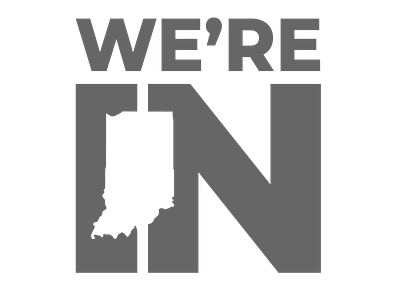
We're In: Indiana Tourism Logo Exploration
A series of logo explorations for a redo of the state of Indiana's tourism logo. A simple, easy-to-understand brand (We're In) is more energetic and youthful, and the use of Indiana's iconic boot shape can't be mistaken for any other state. A series of three uncolored variations (not sure which shape I like best).
More by Jennifer Gaskin View profile
Like


