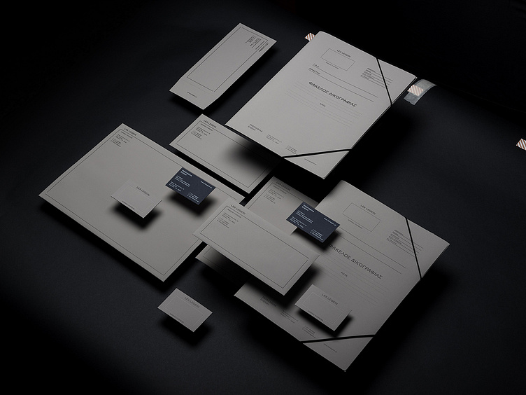
Lex Legein Stationary
Lex Legein is a legal services office located in Piraeus - Greece. They commissioned us to design their brand identity.
Lex /leks/ = Law
Legein /légein/ = Saith
Focusing on the typography itself. We used the initial “L” letters in order to visualise the legal frame that the office works inside. No classic logo in the general sense here rather than a flexible system that adapts on the stationary space, in an effort to imitate the way a lawyer adapts accordingly to the needs of every trial.
Overall there is a neutral, plane and almost undesigned result that makes you feel nervous. Just like the owner felt when she first show our proposal.
Our dialog was something like that…
(20 seconds of silence with her looking at the screen and then back to us.) - Where is the logo? - There is no “logo". We used the initial “L” letters in order to visualize the legal frame th.. - STOP. - Why? - I don’t need to hear anything else. I like it! We’re done!
End of story.
Check full project here
Follow Loonatiks Design Crew on Instagram | Facebook | Behance |
