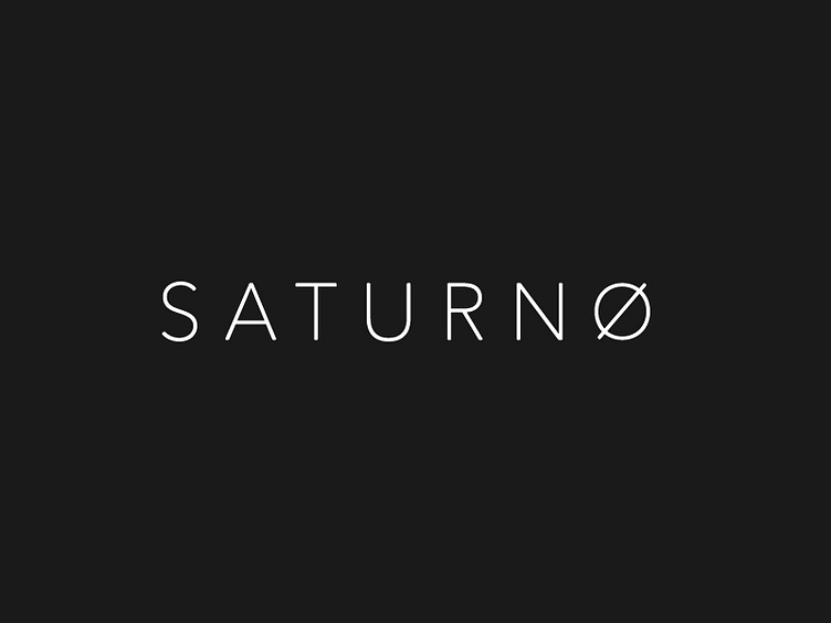
Saturno | Edited Logotype
Looking at my past works, I focused on this.
I remember that it had been successful in various social networks, but one of the tips I had received from many of you was to rotate the O ring obliquely. In my LOGOTYPE COLLECTION on Behance, I modified it following your advice and I must say that it is much more beautiful and complete. This is the beauty of publishing your work online, receiving constructive criticism that often makes grow and improve own work.
What do you think? Better in this version? _____ www.antoniocalvino.com
Social Links: Facebook | Instagram | Behance | Ello | Twitter | Linkedin | Pinterest
More by Antonio Calvino View profile
Services by Antonio Calvino
Like

