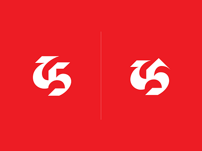
Personal Logo - exploration
Which one do you like better? I've been exploring ideas of how I can renovate my current personal logo. While playing with the shapes, I've noticed that there's a sneaky silhouette of a dragon . It's more pronounced in the option on the right. Can you see it? I've already been told that I'm imagining things based on my 'Game of Thrones' binge:)
More by Viktoria Stalybka View profile
Like
