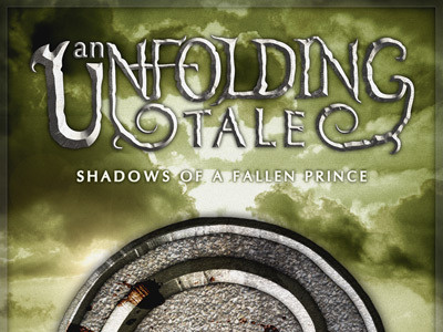
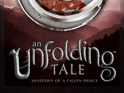
An Unfolding Tale Cover Concept - Version 2
Still working on the conceptual cover art for An Unfolding Tale. I didn't really mention this in the previous shot, but this artwork is intended for promotional purposes and to act as the eventual cover for the first eBook collection.
Changes:
Positioning - I just wasn't happy with having the title at the bottom of the page, so played around with it a bit until having the title at the top worked.
Title Design - I had some feedback from a designer who works in the cover design world, specifically for fantasy. The suggestion was that the previous version didn't feel quite epic enough and that maybe capital letters would help. Gave that a try and am pretty happy with how it turned out (though I still liked the old version too)
Colour - Obviously, the colour scheme is very different too. This green just has a more sinister feel to it and I think it works a bit better with the content.
Medallion - Worked on the medallion to give it more texture and visual interest
So yeah, lot's of detail and work went into improving this, and I would like to think that I am getting close to a finished product. Thoughts?


