Saberr logo family
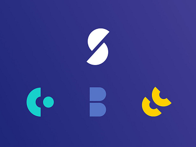
The new brand I designed for Saberr is based on the creative use geometrical shapes. These are the building blocks of the brand - I used them to create logos, illustrations and icons. It’s an adaptable motif at the core of Saberr design language and it ensures strong visual consistency.
The 4 logos - Saberr, Coachbot, Base and Coaches community - are one unique family of logos, all clearly linked together.
Every logo is formed of two parts that feel closely linked, like puzzle pieces they work together to form the whole. A subtle idea that has a teamwork undertone to it.
See full project here: http://www.rossanapiazzini.com/saberr-full-rebrand/