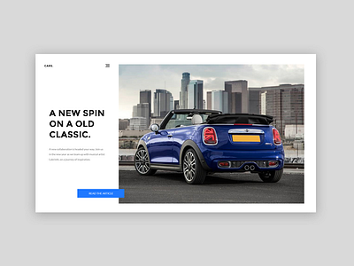
Automobile magazine website - Landing page
This is a personal project to study visual hierarchy from Gil Huybrechts Visual hierarchy and spacing in web design class. Visual hierarchy is important to establish visual contrast so users can scan pages quickly. There are different ways to create visual contrast such as color, size, alignment...etc. In this project I create a front page of a modern minimalist magazine style automobile website and pick Mini Cooper as the topic of this first issue.
Mini is a British automotive marque, owned by BMW since 2000, and used by them for a range of small cars. The word Mini has been used in car model names since 1959, and in 1969 it became a marque in its own right when the name "Mini" replaced the separate "Austin Mini" and "Morris Mini" car model names.
Tools: Adobe XD


