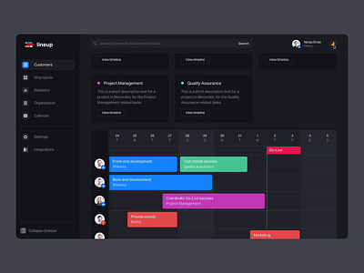
Timeline & Management Tool - Dark Mode Interaction
Hey friends! 👋
I'm super excited to show you a little internal side project of ours that we've been working on. To give you a little background, we have been using roadmap planning tools for our operations for a while now – and when Louis and Marc, our two trainees joined us last year, we thought it would make sense to have them develop a tool specifically made for our company needs.
Our trainees did not have a design to work with for this project, intendedly, so that they could build an understanding for the importance of Design and Development interplay and what specific responsibilities are expected from each department.
Throughout their journey, they quickly realized how important Design was to the success of a project. I've been pairing with them from time to time to help them define the tool without needing a designer working with them – and at some point, the dark mode came up. You really have to get a feeling for contrasts and the nuances of design when you're building an informative interface – Dark Mode makes it a real challenge. We've been looking at it together and I've come up with this interaction concept.
Since then, we've been working on making this possible and I thought we should showcase it here. Our incredible @Markus Gavrilov took care of this animation, and I think it turned out wonderfully. What do you think? ⚡️
I'm happy to hear your feedback and I'm excited to see what our trainees come up with 👨🏻💻
Do you prefer to work in dark mode or light mode? Is it important for you that apps support this feature?


