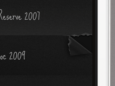
Shindig UI Draft 01
Working on a drink journal app to help you remember what you've had and what you liked.
Kept the interface dark to avoid an embarrassing bright glow if you use this app in a dark bar.
Experimenting with ways to make this app feel very personal to the user, and using Moleskine "hacks" as inspiration. What about using a rip and dog ear to mark drinks you like, instead of using a heart or thumbs up icon? What do you think? Too obscure?
Full size attached. Feedback is greatly appreciated! :)
More by Meng He View profile
Like

