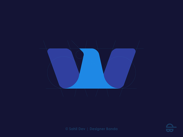
W + Eagle
Identity exploration for a coworking space-related business. The client wanted to incorporate an eagle symbol to symbolize the vision of flying high. The stretched wings resemble two buildings which are used because in future they will expand into real state business. The symmetry of the logomark (W + eagle) forms a close group (chairs/meetings) which stands for the coworking space.
More by Sahil Dev View profile
Like
