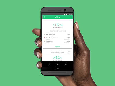
Chime Android
Chime challenged my team to design an optimal home screen for their Android app based on millennial banking research and validation of the existing iOS beta design.
For the UI on this project, I focused on creating joy and clarity of information. For joy, I created a pop-up modal that congratulated users on their savings with the intention of being more habit forming. Moreover, I focused in on adding tooltips since users found certain sections confusing.
More by Geronimo C Ramos View profile
Like


