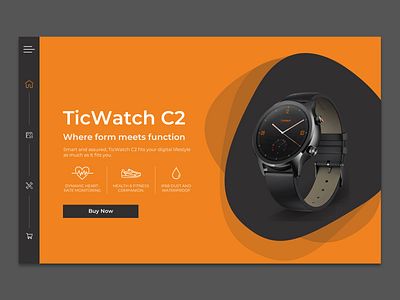
Daily Ui Day #003 Tic Watch C2 Landing Page
For day 3 of the daily UI challenge I decided to look at my wrist for inspiration and design a landing page for the Tic Watch C2! Using linear icons to highlight some features as well as taking a chance with a progress bar on the lefthand side showing where the user is in the landing page this was a fun challenge to work on during my commute to work and an episode of Gilmore Girls later on!
More by Vicki Anderson View profile
Like
