Mission + Market Brand Identity
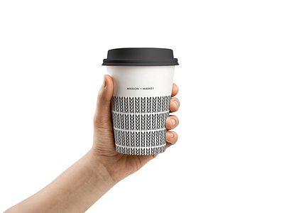

The Mission + Market logo was designed as a minimal icon, inspired by clean and natural food. The mark is made up of five “M” characters that take the shape of an organic pattern symbolic of greenery.
The mark is also a subtle tie back to the phrase most commonly used when talking about great foods – Mmmmm….delicious!
Check out the full project at www.visualsoldiers.com/work/mission-market/