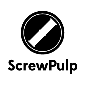
Screwpulp Logo
Logo design for the startup I'm helping this weekend at 48 Hour Launch Memphis. It's for a self-publishing website making it easier for authors to distribute their work, and easier for readers to find unique works.
I took the silhouette of a book end and placed in the negative space to make it look like the top of a screw head. Rotating at 45 degrees adds to the effect and also makes one of those "no" symbols. That adds a little attitude which is what they want.
Not sure on the typeface. Just something clean and modern for now. Still have to decide on a color palate too. Would love to hear thoughts.
More by Will Phillips Jr View profile
Like
