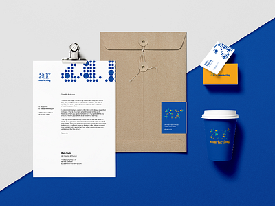
AR Marketing Visual Identity - Stationery
This is a mock of of some stationery for a new visual identity for a marketing agency. The logo is comprised of dots representing clients, team members, and services. When zoomed in the dots are arbitrary and do not make much sense. When zoomed out you see the bigger picture and it all comes together and makes sense.
More by Really Big Kid View profile
Like
