🔳 Bradley's Buttons
@Bradley Taunt is doing awesome tutorials on his site. Really helpful for CSS beginners like me.
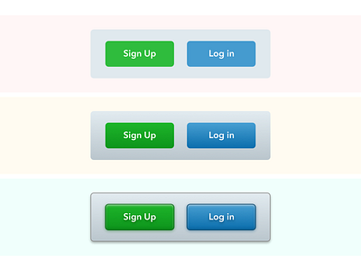
But man, calm down your shadows, be a bit humble with them 🙂 I understand why @Julian Molitor don't like it, because it looks a bit "harsh" for me as well.
I think we can find the medium, that looks and works the best. I can clearly see, that non-flat interfaces lead to a better understanding of hierarchy and combining lightning + shadowing techniques with powerful layout and composition we can achieve great results.
Did some experiments this morning, just for a fun reasons. Everything is doable by CSS.
More by Alexander Vilinskyy View profile
Like

