Time Duration Data Visualization
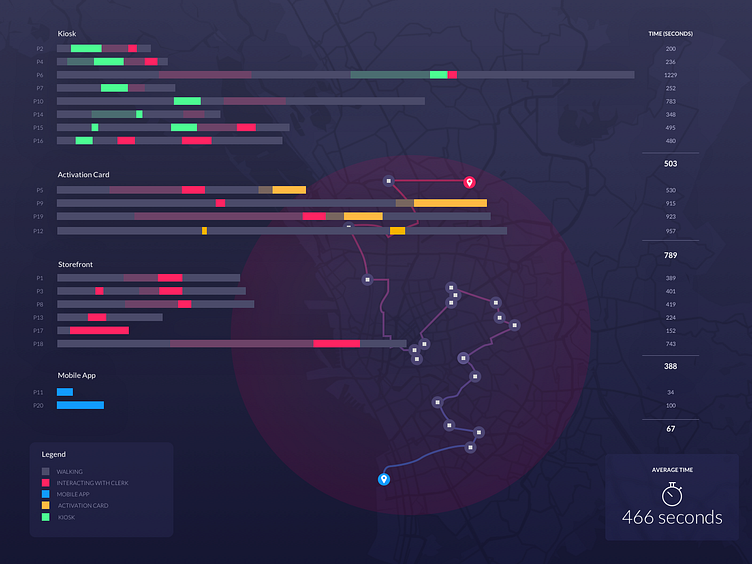
The above visual calculates the duration of different methods of completing the same task. Each bar contains segments detailing how long each step of a task took such as walking and waiting in line.
Data visualization is an excellent supplement to our standard persona and journey map deliveries. Bar charts, like this one, help us identify trends and patterns while creating benchmarks for future research.
Putting everything together, our team is able to create a rich visual story of our user's journey.