Paopart Logo design
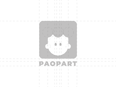
Paopart is a small home of audiovisual products with epicenter Bologna.
The shapes are inspired by the old luminous signs of the various photo brands, located outside the shops of photography, which is why we chose a very large character that enhances the aspects. To enhance the naming we chose a very lively color palette inspired by pop art, usable in various applications.
let me know what you think :) Soon the complete project! Stay tuned...👀