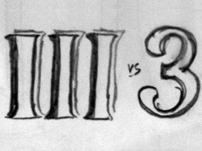
DirtyIIISome - III vs. 3
Working on a hand-lettered design for a skydiving event. Being a skydiver, I'll tell you that skydivers have a very unique sense of humor. So, the 'three-some' part of it refers to the event being sponsored by 3 different skydiving organization, NOT what all of you were initially thinking. Get your minds out of the gutters...or the margins! (Please tell me that y'all got that bit of layout/design humor...)
That being said, I can't decide whether to go with a numeric 3 or a Roman numeral III. I've attached some quick spur-of-the-moment lockup sketches, and even from this brief exploration, I can tell that I like both 3 and III, both of them offering slightly different solutions. As additional elements in the design, I will use small silhouette illustrations of various skydiving-related visuals, but the logotype will be the centerpiece.
Any thoughts on whether you'd use the 3 or III? The aesthetic is completely flexible and 100% up to me.

