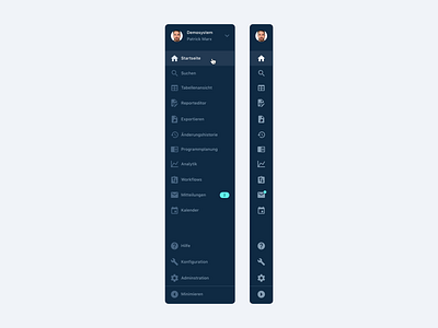
Publisher Software – Web App – Sidebar
Hey everyone, I'm excited to announce that I'm working on a new project. I'm partnering with a developer to tweak the UI of a web app which is currently in beta. He already pre-built and designed most of the UI and asked me to help him put the finishing touches on it. I'm trying to upload more screens as we're progressing.
This screen shows the sidebar which is the main navigation in the UI. We're using the OS's default font and my colleague decided to go with Material Icons. We decided to go with a dark color scheme for the sidebar and a light one for the main content area so you can focus more easily on the important stuff happening in the main area. We'll be giving the user the chance to set a different color scheme though (screens will follow).
I used quite a few tips on color from the RefactoringUI book. I also used Contrast to make the navigation accessible.
Advice is very welcome as always.
Cheers Patrick 🤘
