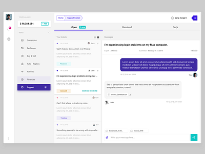
Marketplace - Support UI
I love working on dashboard UI’s because they come with a very unique set of design challenges - ones you don’t usually encounter when creating corporate websites and portfolios. 💯🧠
The main focus shifts from the “story” to handling the larger amounts of data and displaying it not only in a practical and intuitive way but also in a manner that speaks to us as a fellow human would. 👌🤗🧐👥
This is a Support Centre interface which will be part of a web transactions app coming out later this year. It’s been an interesting process so far and it’s not looking to get boring anytime soon. 👑 #userinterface
This version has hints of blue in it, but there’s also a super slick all-white version, so stay tuned, I might just share a couple of new screens down the line ;) 🙃😍🙅🏽♂️
Hit that LIKE button guys if you find this post useful :)
